Good website design shouldn’t be underestimated. You don’t get a second chance to make a first impression – that’s why your website and website design is undeniably one of your most valuable and important business assets. If your potential customers aren’t engaged or don’t like your virtual shop window they can just hit the ‘back’ button and head straight for your competitors in seconds.
They say we don’t judge a book by its cover but humans are highly visual creatures so what makes a good website design?
A good website design has a combination of the following
Never underestimate the power of a good website design. It’s like making a first impression in person. The design of a website is important because it can affect how quickly your visitors find what they’re looking for. If they find it difficult or frustrating, they’ll probably leave which could be a missed opportunity. A good website design is easy to navigate, helps people find what they’re looking for and can take them one step closer to getting in touch and being a new business opportunity.

A website’s design will make a visitor decide to stay or go. It really can be that simple. You need your site to create trust, make sense and make the important things quick and easy to find.
Let the user know they’re in the right place
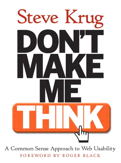
We heed the advice of Steve Krug in his book ‘Don’t make me think’. When your users land on your website, they make a judgement in seconds and in a busy, attention demanding space they need to recognise what you do instantaneously or they won’t stick around for long.
So make it obvious.You don’t need to complicate names for your work, blog, or jobs section. As Steve points out, “if Web pages are going to be effective, they have to work most of their magic at a glance”. Don’t let your users head elsewhere out of frustration. It should be clear that they are about to find exactly what they’re looking for from you.
The design must resonate with your audience
A good website design will have clear direction for users. It’s better to have a narrow focus and get rid of the fluff (KonMari your website if you like). Having clear language, targeted headings, specific calls to action that are aligned with your ideal audience will make your website a success. SMART goals are a great direct tool to help you organise this and get your business where you want it to be.
Don’t throw everything at your users all at once. Keep it short and sweet. Everyone is going to use your website differently. We are, after all, individuals looking for different things. In The Copy Cure by Marie Forleo she talks about CPR for your content. That’s Clarity, Personality and Resonance. Remembering these three simple things can help give you a bit of guidance. If you haven’t already you should go and check it out. Quite simply, clarity points to using simpler language and forgetting the unnecessary words or alternatives. Think you’ll instead of you will or it’s instead of it is. Which brings us onto personality because you want an online representation of you. Put your voice onto paper so to speak to help engage with your target audiences. Finally, resonance. If you know you’re audience think about what it is they want to hear and see. Without them your business is nothing.
Your design portrays a clear value proposition
If you have a look at your website, is it clear what your value proposition is? What will keep your visitor on your site and get them looking around? It’s like the milk, eggs and bread at the back of the store. Supermarkets do this to make us walk through the store and see all the products on offer (that’s our take anyway). We’re not saying annoy your users but keep them on your site for longer.
Pulling out, defining and shaping your value proposition is tricky. We’ve got you covered in our book, Content Pizza
Make sure your site is responsive!
This may sound like a no brainer and a little obvious but you’d be surprised how many sites there are out there that aren’t optimised for all devices. It should respond nicely and present your information clearly. Whether you’re using a desktop or laptop, when you change the size of the window that your site is open on the content should move to fit this.
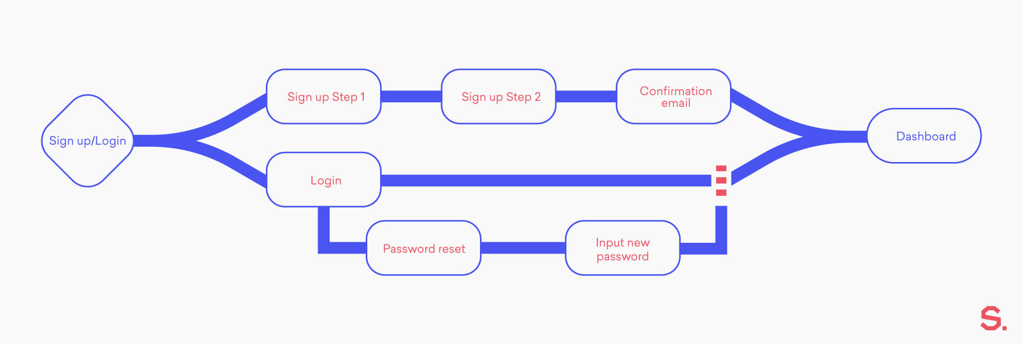
A good website design will be easy to use. That means easy to navigate no matter what device the user is viewing on and making sure there aren’t any prohibitive objects that get in the way. Pop-ups, overlays, difficult menu buttons and overstuffed with too many components that will annoy users and create friction in their experience.
Is your site up to date?
Good websites are never finished (yes this includes our own!). Technology and trends are always changing, and it’s important to keep up to date to keep your site looking it’s best. You need to keep your users engaged. Testing and updates can help with industry changes and the way user behaviour can evolve. Ultimately, there is always something that can be improved on a website. It’s worth your investment so ongoing maintenance can take place and is also really helpful to your sites SEO.
Not maintaining a site makes it difficult to build connections and relationships with your users. You need to keep your content fresh and updated, Google will love you for it!
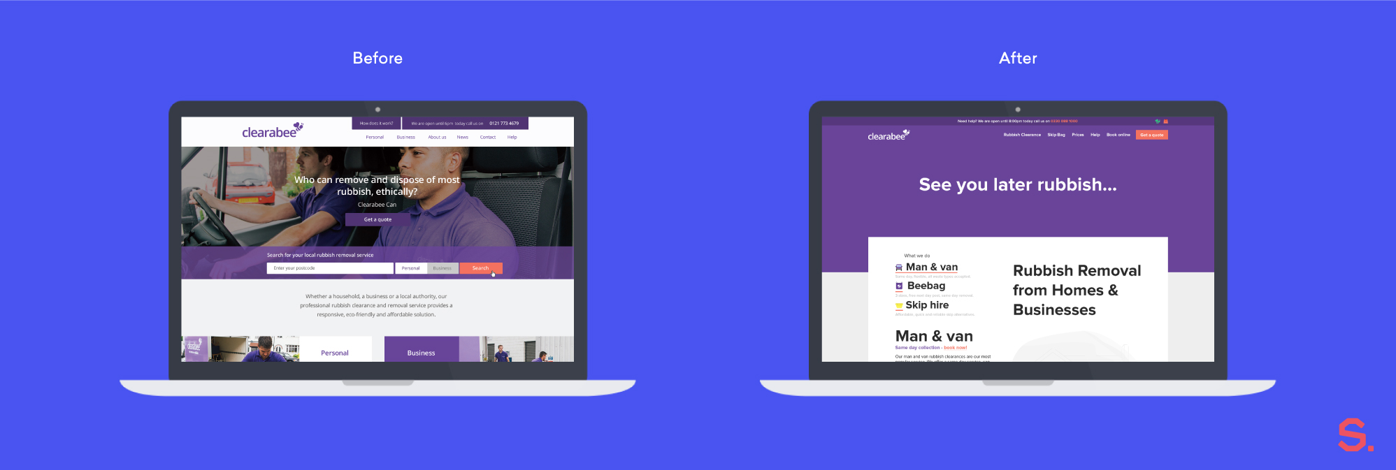
It’s not all about looks. An effective website will build trust by being up to date, communicate your proposition and direct users to the next step or drive a call to action. It’s where form meets function.
If you think your website might be a little out of date, get in touch. A member of our team can talk you through our services or what we can do to take your website from uh to uh-mazing.
Need some web design inspiration?
The Smoke Haus
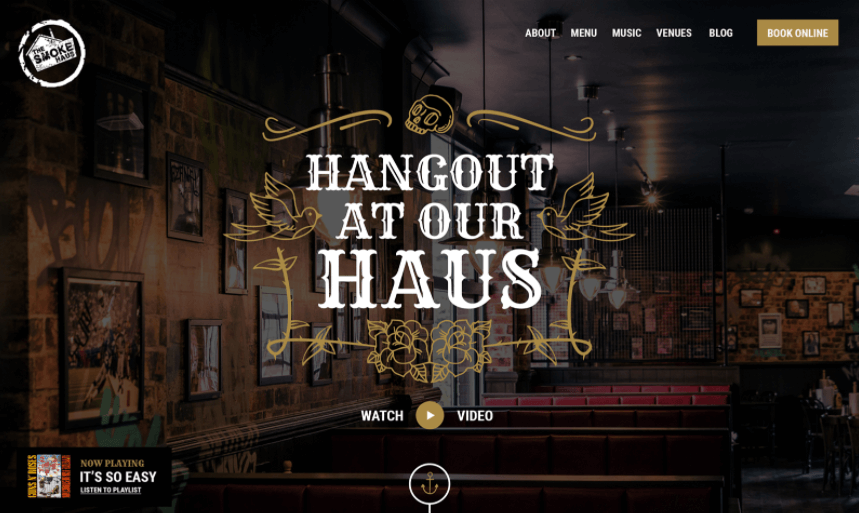
Why is it a good website design?
- “Yum, that food looks amazing” is what we think when we land on the home page.
- The great photography, short and welcoming headlines invite users to want to experience the restaurant.
- The animations on loading and subtle effects on scroll keep the user interested and draws the eye to specific calls to action.
The UK Sepsis Trust
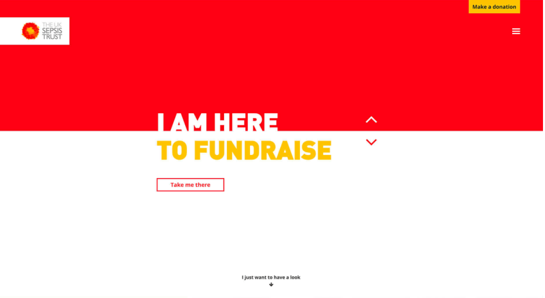
Why is it a good website design?
- Right from the home page you can choose what it is you’re there for, this helps to create direction for users
- Bold colours grab your attention, helps you to remember a site
- Simplistic layout with clear headings make it easy to navigate
- Straightforward navigation, you can easily see where to find out about the charity, how you can help, what The UK Sepsis do. It’s informative without being overwhelming
Sixth Story (yes we know this is our own site!)
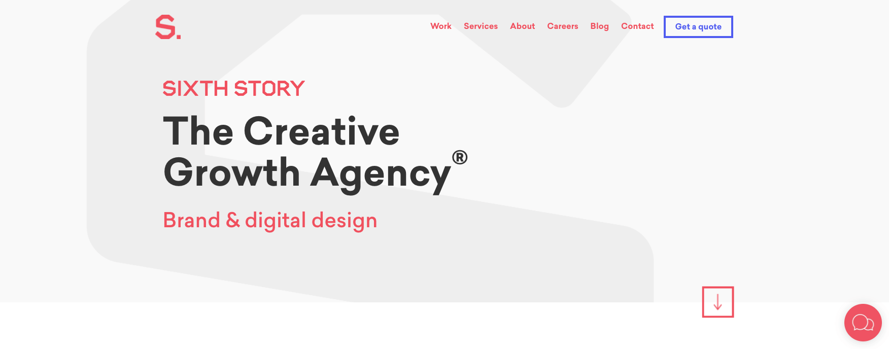 Why is it a good website design?
- No information overload: short and to the point
- Simple, bold design
- Clear navigation. You know what you’re getting when you click on a button, no complicated or unnecessary language
- Parallax elements as you scroll are pleasing and eye catching
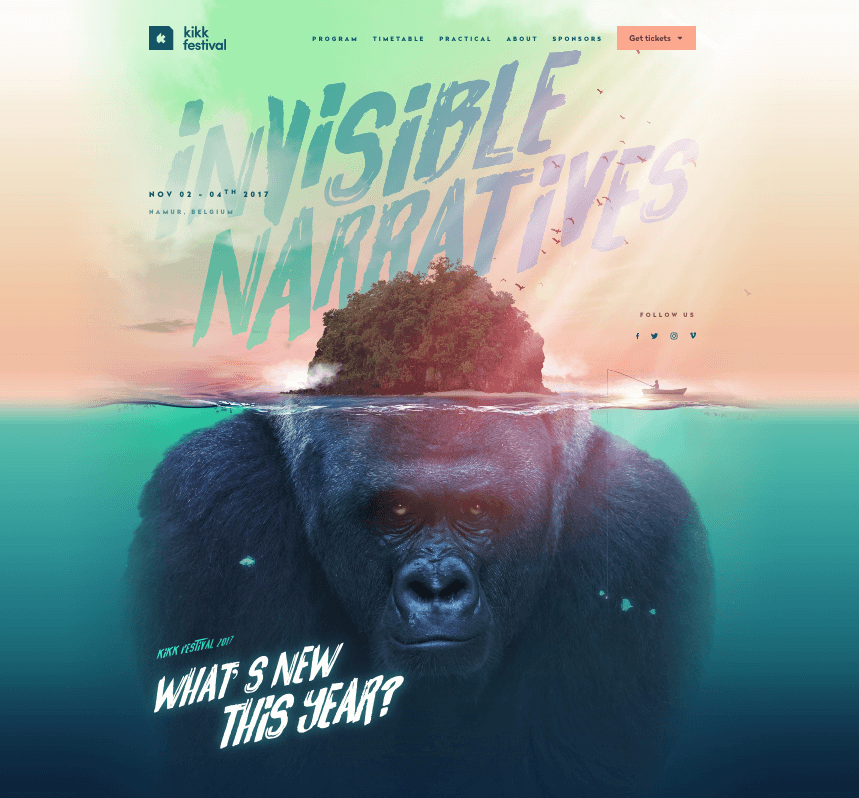
Why is it a good website design?
- Captivating, creative use of video and animation (it’s also in line with pop culture: king kong)
- Strong, bold colour. Turquoise is renowned for protection, and also a soothing, relaxing, healing, earth colour.
- Continuous subtle effects whilst scrolling. It keeps the eye and mind engaged in content
- Continuous ‘sea theme’ that provides a relaxing element, helps set the theme of the festival making it an easy website to use and you feel like you want to look through and find out more
- Attention to the smallest details enhance the overall visuals of the website

Why is it a good website design?
- Great simplicity with the colours and layout so it doesn’t feel overwhelming or as if you’re being bombarded with information, easy to navigate
- The use of diagonal lines for each section helps to encourage the user to keep scrolling down the page
- Graphics and animated images keep you engaged, it’s easy to see what each paragraph is about without having to delve too deep into the site
- Helps you to focus what you’re trying to find with the emphasis being on your customer and helping a business, it’s clear what service they’re providing
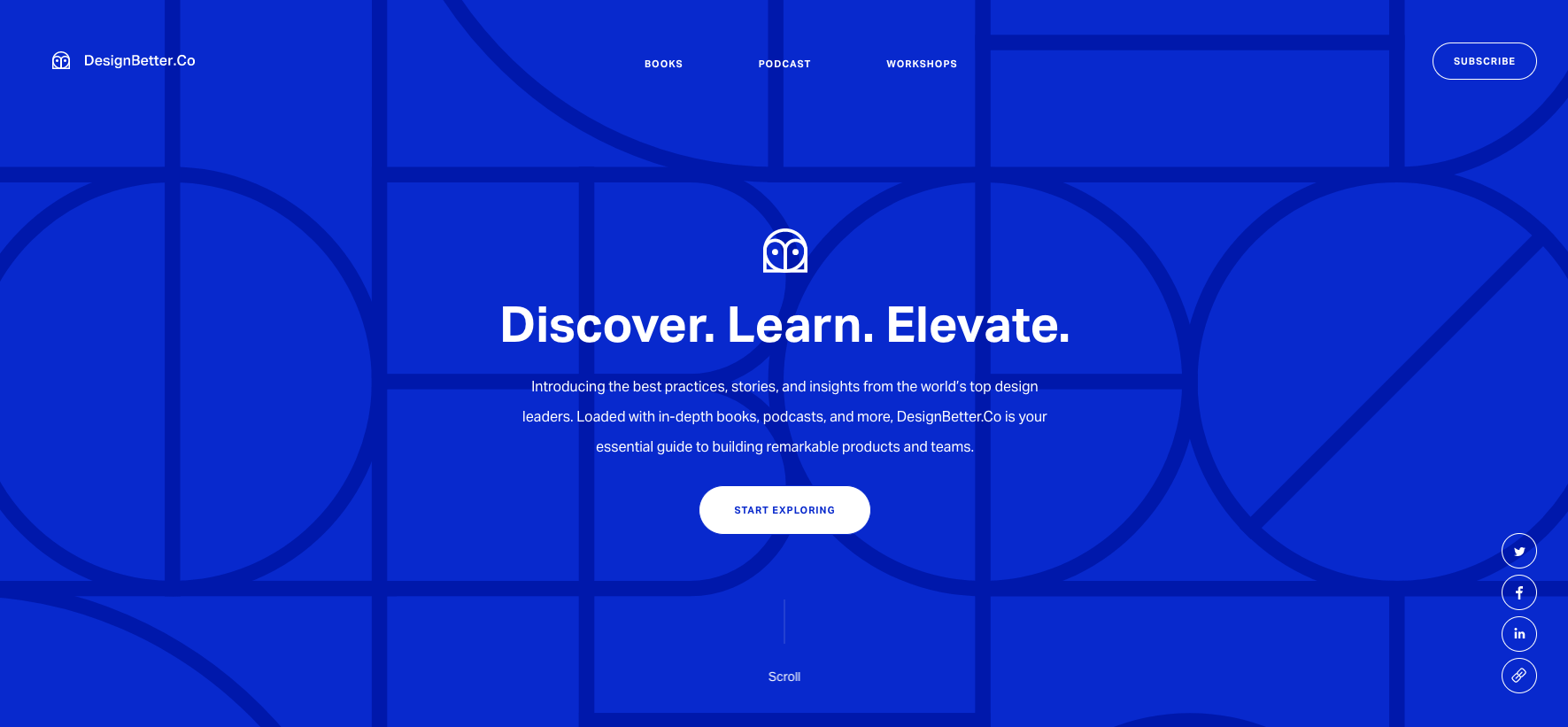
Why is it a good website design?
- Even though you’re scrolling through one page, it doesn’t feel like it with the changes of colours and the way the images move as you scroll
- Simple, bold and ultimately eye catching
- Consistent use of image and iconography styles help to build trust with the brand and reinforce value of the resources
- If you know you know, the authors are the Vice President and director of design at InVision
- Simple and clear. There are some useful tools that are easy to find and readily at hand. There’s no complicated jargon where you don’t really know what you’re signing up for or looking at