State of the Browser is a 1 day single track conference put on by London Web Standards. The talks focus on modern day web design, accessibility and usability. At £30 for a ticket it has to be one of the best value conferences out there. This year had a great speaker list including the likes of Andy Clarke, Bruce Lawson and Laura Kalbag so we popped down to see what they all had to say.
Held at Conway Hall (owned by the Conway Hall Ethical Society) – a venue that hosts a wide variety of lectures, classes, performances, community and social events. It is renowned as a hub for free speech and independent thought. A fitting venue then for a day of talks about how we can make the web better for everyone!

The day started with a really energetic talk from Bruce Lawson, one of the co-editors of the HTML5.3 spec and a vocal supporter of the use of semantic html. His talk also introduced a new way of paying people for content on the web which hopefully will become a web standard over time. The concept is that you include a line of code in the head of your web page and then if a user browses the site who is signed up to Coil they can pay you whilst they are on your site. We are talking fractions of a dollar here and it does have limitations currently.
Coil currently works in Puma browser and only has extensions for Chrome and Firefox, but it is open to sign up for now (in BETA) and has various contributors already on there but things are very much at an early stage. It got me thinking about how this might affect our browsing experience in the future.
Great for content creators
Artists and creatives, bloggers and musicians will all be able to receive payment for people accessing content without having to spoil the experience with ads and modal pop ups.
The ability to offer premium content for paying visitors that is a good alternative to subscription services and would be loads less annoying than things like Medium. It is anonymous so users privacy is respected.
The future is bright
I am super excited to see where this leads and really hope that it is something that does become a web standard. The current website experience is awash ads, every other paragraph in some instances or with articles broken into 10+ pages with a little text and ad on each. To reduce some of this so the user gets the content they want AND the creator gets some recompense for it is a great thing.
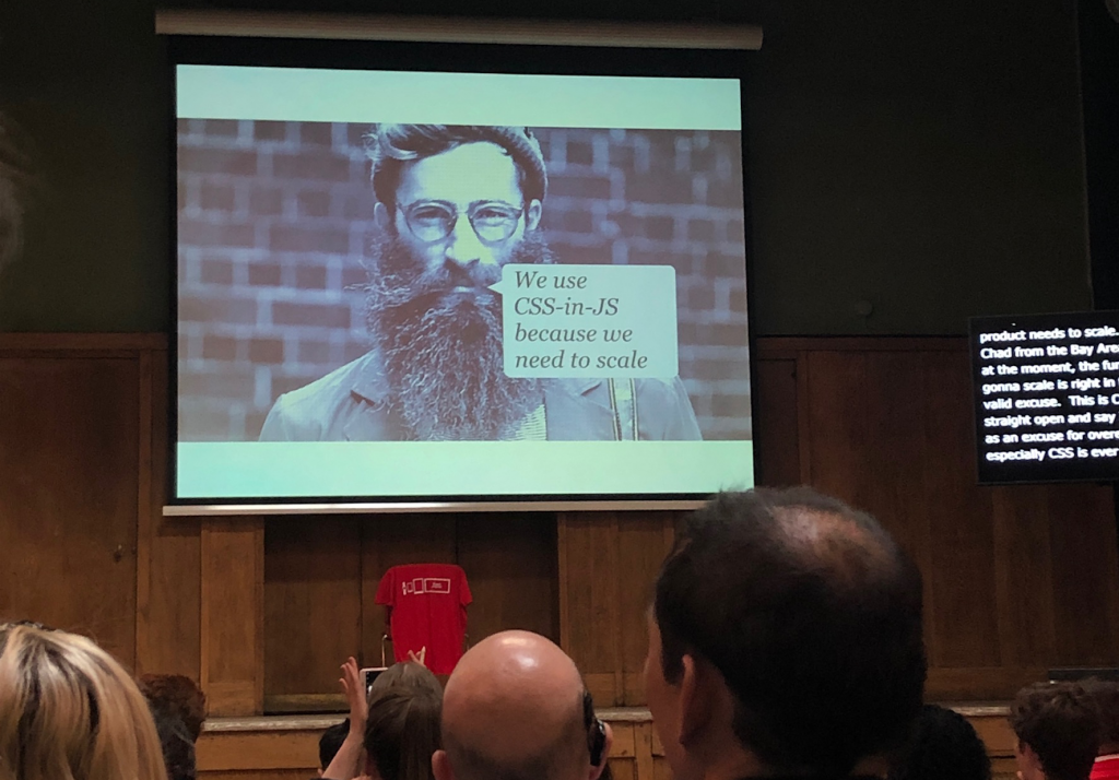
The morning flew by, with Sally Lait talking about accessibility and Andy Bell providing some no nonsense (and slightly feisty) thoughts on flexible CSS. If you have any interest in front-end development then Andy’s talk is well worth a listen.

The lunch break was pretty short as most of the talks had over run but I don’t think anyone was sad about this as it had been so engaging! Laura Kalbag carried this on in the afternoon with her talk about accessibility. Laura is passionate about ethics and privacy in technology and is a great speaker.
There are so many basics that get missed and one of the biggest failings on the top 1million web pages is colour contrast.
This is something that is so easy to be sure of at the design stage that we really need to be moving on from the days of small grey text on a light grey background. There are even plugins for Sketch and the like that will allow designers to check a button or other component so hopefully this is something we will see change over time.

Art Direction for the Web
The afternoon was rounded of by all round nice bloke Andy Clarke – author of Hardboiled ( a css bible) and more recently a new book called Art Direction for the Web.
With the layout tools we now have at our disposal and their adoption throughout modern browsers there has never been a better time to be building websites. The use of Flexbox and CSS Grid means we can achieve layouts that would have previously been really hard with much more confidence and with no need for hacks and cheats.

Taking a lead from magazine design BeaFeitler , specifically Andy walked us through the concept of compound grids and how we can create them using modern layout techniques. This was so refreshing as currently with such a heavy leaning on user experience, grids and boxes and everything looking and feeling the same it can feel like there is nothing left to design it is so prescribed.
Everything has its place and we are not going to be creating crazy layouts for product list pages any time soon, nor should we be – however there is ample opportunity to embrace some of the layouts used in print and magazines in certain situations. Premium product detail pages are a perfect example as the user has already made the decision to read more or is interested when they arrive. Using some beautiful layout to sell in the desirability of the product is exactly what we should aim to do, think about car or perfume adverts.
Till the next time
With the talks done and an after party beckoning it was time for me to head back to Birmingham. As ever, when you leave a day of talks you are full of ideas and intentions and inspiration. It is just the thing you need to keep you enthused with the industry and also to remember it’s not all tech bros and Twitter spats – there are some very clever people working really hard to make the web a better place for all. Long may it continue!