The web space hardly stands still. Each year we see new trends emerging and others fizzling out (which isn’t always a bad thing). The constant dynamics in web design happen to accommodate the evolving user browsing patterns – from the way people access your website to how they perceive the presented information.
5 Pillars of Outstanding Modern Website Design
Whether you choose to re-brand your business or commission your very first website, take a look at the defining principles of modern website design outlined by our website designers from Birmingham.
Modern Website Design starts with the user
Surprise, people no longer read content on the web! They scan and skim the pages for headlines, key slogans, highlighted keywords and other eye-catching elements to understand what’s it all about as quickly as possible.
- According to Chartbeat, most readers scroll about 50-60% of an article page on content-heavy (news) websites.
- Nielsen Norman group reported that less than 20% of text content is actually read on a web page.
- A usability study conducted by Gerry McGovern identified that only 1 out of 15 participants could locate a specific piece of information that was placed in a non-scannable way on the page.
As a business, you have less than 10 seconds to entice the potential visitor and gain their full attention. So lay out the content accordingly to make those ten seconds count.
The majority of people scan pages using the F-pattern, especially the text-heavy ones.
![]()
The heat maps from above show how people scan a corporate “about page” (left), e-commerce page (centre) and Google search results (right).
It indicates that when presented with large chunks of texts people tend to:
- Actually, read the first two paragraphs/lines on top.
- Focus on bulletin points, subheads, and short paragraphs.
However, when facing a less text-heavy page, users tend to look through the page using Z-pattern:
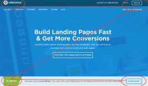
This pattern is more applicable to dedicated landing pages or websites featuring less content, like Unbounce homepage pictured above.
- Point 1 is usually used a prime location of your logo.
- Point 2 features one of your call-to-actions.
- Centre of the page – includes a featured image/content that separates the top and bottom sections and helps the eye slide along the Z path.
- Point 3 provides additional information and/or serves as another attention trigger.
- Point 4 features an additional call-to-action or your primary CTA.
Bottom line: While graphical elements are important, efficient and modern web design makes it simple for users to retrieve the desired information fast. Opt for hiring website designers with UX credentials as well .
Modern Websites Are Well-Optimised
They are optimised for users in form of effective and clear navigation as mentioned above, and for the search engines as well.
As mobile traffic has already surpassed desktop traffic in a number of locations worldwide, including the UK, Google has recently announced a switch towards mobile-first indexing.
In plain English, that means that the search engine will now scan mobile websites first and based on the retrieved data rank them in search results both in mobile and desktop search results.
So if you somehow still have a non-responsive website or have neglected your mobile website all together, you’d better hurry up to fix that.
The other essential aspects of optimiSation we deploy as part of our comprehensive web design services in Birmingham include:
- Load-time and website speed optimiSation, which also influences your search rankings.
- Crisp website code that ensures fast and smooth search indexing.
- OptimiSed website navigation and content layout to ensure lower bounce rates.
- Crawlable link structures and optimiSed images.
- OptimiSed URL constructions.
- Smart canonicaliSation to avoid duplicate content on the website, especially if you are using non-custom CMS.
Modern Websites Rely on Video
Websites featuring product videos report having higher average order value and higher conversion rates.
Here’s the correlation between the number of videos watched and the AVO:

Product explainer videos tend to increase conversion rates by 20% according to Unbounce and including a video on a dedicated landing page can result in up to 80% increase in conversions.
Unlike large text blocks, our brains process videos approximately 60.000 times faster, hence visitors feel less reluctant to watch a video opposed to reading all the texts.
And the benefits don’t end just here. In our previous post, we spoke about the additional impact video content has on your business.
Modern Websites Are Secure
With the recent wave of online security breaches and customer data leaks, the privacy concerns among users keep boiling up.
A recent study revealed that 36% of the UK consumers feel reluctant to use certain web apps out of security concerns and these “concerns” have cost the UK economy almost £2.2 billion in 2016 alone.
If a payment form glitches, if a page doesn’t load properly or if there are no prominent trust badges and security guarantees in place, a user will bounce off and choose not to entrust your business with their personal and payment data.
Our website designers equally care about the backend website security and the customer-facing façade and we make sure there are no “loose ends” a hacker can take advantage of.
Modern Website Design Features Distinctive Typography
Typography is the backbone of your brand. It can give users subtle hints about who you are. Are you a serious or more of a laid back company? Functional or informational?
Typography sets the mood for the talk and serves as an additional mean to convey the feelings and reactions among users – something that good texts can’t do alone.
Let’s illustrate this point. Here are the two distinctive websites we have designed for our customers:

YourVets font choice was more informal with a cute icon added along the main headline. Together it created a sense of a friendly, laid back and welcoming atmosphere – just the one this company has in their clinics.
And here’s the typography we chose for Snouts & Pouts – another pet-owner oriented website that sells more refined goods. The font choice, in this case, sets a more exquisite atmosphere of a premium shop.

Apart from the obvious visual appeal, typography plays another important function. It compliments the texts in a flattering manner to ensure that those are actually read. Unreadable font pairings, large chunks of un-styled texts and lack of distinguishable headings/subheadings will hardly result in higher user engagement. And fulfilling the requests given in bad fonts is rather difficult, don’t you think?
Bottom line: Typography should be an essential element of your comprehensive brand guidelines. After all, type is branding. Don’t neglect this opportunity to communicate better with your visitors.