Packaging Design is all about strategy.
Getting the consumer to understand what a company stands for at a glance isn’t easy.
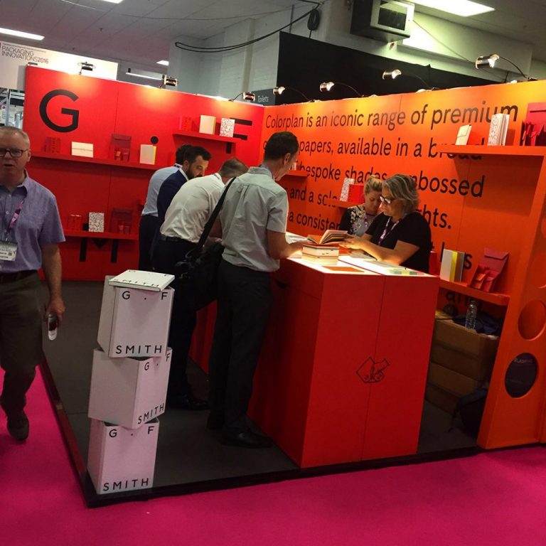
We went to the Packaging Innovations Exhibition 2016 and The Dieline Conference last week, aiming to search out new innovative packaging and paper solutions for future projects. With the likes of G.F.Smith throwing beautiful paper samples our way, how could we resist?
It was interesting seeing the unique materials that are now readily available. From packaging made from coconut fibres to carbon black free paper (ideal for hot foil printing), whatever you desire seems to be out there. These endless materials can inspire a designer to think beyond plastic and standardised structures and search out a new realm of consumer interaction with a product.


Designing packaging with the audience in mind.
Our first talk was given by Pearlfisher and Wagamama, discussing their project creating new packaging for their takeaway food service. They spoke about the process of the products from designer to consumer, and how the customer experience is at the forefront from the very first sketches. As a food based service, they explained that there were obstacles with the structure of the containers, separation of ingredients and keeping materials up to food grade standards. In total from brief to customer consumption, the project took 9 months. It was interesting to see how they used their packaging to increase reach through social media and had first hand reviews of their products without having to contact customers directly. They discussed how doubling their packaging costs as a company was a risk worth taking for the customers new experience with their food.
Branding and packaging go hand in hand. Whilst the structure of the packaging needs to be tactile and aesthetically beautiful, the branding catches the eye of the consumer – whether it is minimal or obtrusive. We always start our ideas out on paper, and as consumers ourselves it is good to switch off a computer now and again and rely on intrinsic methods of design.


Top 5 things to look out for when designing packaging
- What experience does your customer want? Simple or complex?
- Where is your product going to be displayed?
- How is your packaging going to stand out against everyone elses?
- Have you chosen the right material? Is it sustainable?
- Even the best packaging designs don’t satisfy all the consumers. Have you found the middle ground?
Strategic design always wins.
We later sat in on the panel discussion from the likes of Elmwood, SC Johnson, Neilson Design Solutions & Pearlfisher. They talked about how having a strategy before defining the brief is important as well as collaboration between the designer and the client. Using the consumer journey to convince the client of an idea and mapping out their process of using the product is a great way to explain design choices. When you design, you should always talk to the target audience. Put yourself in their shoes. What is the customer going to do first?
We always use customer journeys in web design, looking at the target audience and how they navigate around a page. This allows us to see our designs from the eyes of the viewer, tapping into keywords and improving layouts. This was a key theme in the panel discussion – getting a product out there for testing, refining it and then re-launching with more confidence. A second glance is always more informed.
As a design agency, we are constantly looking for new approaches and ideas to use across the board, from branding & packaging design to marketing and web. Seeing the approach behind projects from other designers was interesting and gave us more fuel to build on our approach and design structure. We love working with our clients for the best possible reflection of their brand, and pushing the boundaries of design without losing the audience.